Showing posts with label inspiration. Show all posts

Thursday, 27 February 2014

Style Models:

After my draft I have been looking at other magazines to see which are the ones I have taken the most inspiration from, also the ones that have given me ideas of what I want to create in my magazine. This is important for my design because it enables me to realise what components of the magazines I'm reading will go into my own magazine and what I love the most about magazines of the same genre that are already on the market. Also with my style models I have been able to recognise what other magazines are on the market that are the same as my genre, because most shops only stock the really popular magazines such as NME and Q; I have been able to look beyond those and see the new and more quirky magazines that are more in keeping with the ideas that I have had originally. Magazines such as Clash, Dazed and Confused, etc have inspired me to think outside the box and push the boundaries on what is normal inside a magazine. My final magazine design will be slightly different due to the fact that I have thought of new ideas and those new ideas have sparked other features that I could possibly add to my design, and this is due to the fact that I have been able to look at different magazines and their layouts and features and by looking at them critically I have been able to see which aspects of that magazine I like the best and apply them to my own design.

The magazine that has influenced me the most would have to be Clash (in particular Issue 91, featuring both Earl Sweatshirt and Banks on the front covers)


For me this is how I would want my magazine to look, more so the front cover with Banks on the front because I love that photography (that is something I was intending to re-create however I struggled with finding a suitable way to do it within a studio) I also love the choice of font and how that was incorporated and laid out on the front cover because it looks so effortlessly placed on the page. For my next draft I might try and get a similar font and re-create this layout of the coverlines.


Also another aspect I like a lot is the different names for the issues (from L-R: The Festival Issue, The Tech Issue, The Fashion Issue, The Denim Issue), this is something I have tried to re-create this on my magazine already however I think I am going to alter it slightly (by just re-naming it). Also on these slightly earlier issues I really like the font used and again, the placement of the coverlines, I think it looks really classic and understated which is the look I would like to re-create on my final design. I have already started to develop my final design, it is a lot different than my first draft (implying to the front cover) and it also looks a lot different to these magazine covers, however I am still playing with ideas and I think I have time to experiment and see which design I prefer and see what fits the style of my magazine and genre the best.


Even though this magazine isn't quintessentially a music magazine (it is a women's magazine for fashion) I am still very inspired by the design of this magazine and it is one design option that I am thinking of because I think it could work in a music magazine context. The photography is something I am looking at as well and it is something that I am going to re-create; for example I am going to take the pictures and apply a black and white effect over the top to create a similar effect to 'The Gentlewoman'. Also with how they have different colours as the background with the white border surrounding the main image, I might see if it works on my front cover and whether I should include that on my magazine at all.

Thursday, 6 February 2014

More Covers That Have Inspired Me:


Here are more covers that have proceeded to inspire me. I am in the middle in creating my draft and I have been looking at more unusual pictures that have helped me to actually reach a new creative level. I want to be creating something different and original and to do that I want to see the magazines that have excelled themselves in being unique. What I love on these magazines is the simplicity and also the colours schemes. With magazines such as Betty (which isn't actually a music focused magazine) each of the issues they release coincide with each other and the colours, even though they're different colour schemes, work together all the time and it looks like the style of the magazine is really reflected on what the colour scheme is. Also Betty doesn't include the bar-code on the front of the magazine which is unusual and not really seen throughout the magazine community. This subtraction of this 'vital feature' really sets apart this design and the differently coloured backgrounds, instead of the usual white or mono-tonal shades, also attract the reader's attention. The rest of the covers I have found are also set apart by either their colour scheme or the style of photograph taken, and sometimes even both. This originality and uniqueness have really captured my eye and I'm sure they capture many others as well. 'Studio' magazine is one that has really had an effect on me and the complete yellow scheme of colour is really something that I may try to incorporate into my design;  especially on the cover, colour schemes need to be kept simple and this is a good example of this because it is such a bright colour that it is different compared to the usual black or white. All of these covers have really had an effect on my first draft and I am going to take inspiration from them for my final draft as well. Hopefully I will have the chance to be able to re-do a few pictures this is because I would like to get the same kind of effect that these magazines have seemed to produce.

Wednesday, 29 January 2014

Photography Techniques:

I have been looking at different photography techniques today, because I want to make sure that my photographs that I am taking this week will look professional and stylish enough that it will make my magazine look more realistic and believable. 
So for this I have been on numerous websites to see what professionals have to say about taking a good portrait photograph. Some of the things I have found are things that I can't necessarily change and alter before I take my photographs, such as using a longer lens on the camera because I not guaranteed a long camera lens before I take my pictures.


  1. The first point that I have found is to KEEP THE BACKGROUND SIMPLE. It says on Digital Photography School that "The more complex your scene is the more unlikely you are to get a shot that is the X factor. Keep your backgrounds (and foregrounds) uncluttered, work with natural light where you can, if you have to use artificial light keep it simple and use as few lights as possible." This is good for me because I will be using a studio that already has access to a number of soft lights and back lit screen, so hopefully when completing my portraits that I will be able to use this equipment to my advantage and take some really simple yet effective pictures.
  2. The next point is that EVERYBODY HAS DIFFERENT TECHNIQUES that they use. Also on the Digital Photography School it says that different photographers have different techniques that they like to use. For example there are photographers that take the photos slightly below the subject's eye line, whereas there are some photographers that like to take them slightly above the eye line. It is personal preference and also it depends on what models you have got and whether it is more flattering to go above or below the eye line. For my photography, I am going to decide when taking my photos what is more flattering for my models at the time.
  3. What I learnt next was that you should SET UP THE SHOT BEFORE INTRODUCING THE SUBJECT TO IT. Digital Photography School also say that it is crucial to set up the shot before actually putting the models in the frame, "Be as prepared as possible before your subject arrives. If you’re shooting in a studio have your lighting ready and camera set up and ready to go. If you’re shooting on location know where you want to shoot. Have your camera’s settings ready to go and even do a few test shots before your subject arrives. This way you don’t keep them waiting around and get to photograph them when they are fresh." This is an important aspect for me because I want to have my chosen models as natural and fresh as I can get and this point helps me a lot in planning and prepping the camera and equipment before I introduce them to it.
  4. I have also learned a number of other techniques such as remembering to make sure that all of the equipment is working correctly before taking the photos because it's not good to have everything set up and right before taking the photos the camera battery dies. The whole thing is about preparation and planning for what you want to achieve in the time set to take the photographs. Also a tripod is a good idea to help get a nice straight shot, without any hand movements. In saying all this though, I have discovered that I really want to immerse myself in this new task and create something that will hopefully teach me some new techniques as well as making my magazine look more professional.
In conclusion to this research, I have realised that even though this might be a new and interesting task that I shouldn't under or over estimate myself and use the knowledge I already have by looking at differentphotographers and music magazine front covers and creating my own style of photography off the back of that.

Monday, 27 January 2014

My Chosen Band

Band Name: The Requiem

Album Name: Memorium 

For my band they are going to be a twosome who specialize in the indie/alternative music genre.  I have chosen the name 'The Requiem' because first of all I liked the sound of it; and it sounds like something that would be a real band name. Also it just means 'any piece of music composed or performed as a memorial to a dead person or persons', so even though it has a fairly morbid meaning I want it to mean that they are music reborn in a way. The traditional ways of music have gone and they are there to play at the memorial with their new sound. I have created this name using a random band name generator (I had used the Wikipedia random article technique, however I found nothing that really sparked any imagination so I used the random band name generator just to spark some ideas and develop them myself).  Their style that I have already had in mind is going to be very casual and however with hints of elegance and maturity. I'm going to style my models in this kind of way, I want to create a kind of effortless feel to their persona. Their music would be quite dark and stripped down (an example of this would be Warpaint, as I find their music style to be very laid back and almost like they are not even playing the instruments, like some kind of unknown source is creating it for them), therefore I would like to style my models in such a way that you can see their genre and music style comes through and without actually having to read the article, you know straight away what they are all about. Also to help me get this across as well in my magazine, I would like to take the pictures in a certain way to accentuate this feature of their indie/alternative genre. For example I would like to keep the pictures quite dark and almost moody because this is what I feel like my magazine will be like in it's general genre, I also want my models to be dressed in dark clothing because yet again I want to get across this moody image.
For the photographs, my main idea I have had is that I will keep one main soft light on my models and every other light will be turned off, this is something I am yet to actually test out but when I come to take my pictures I would like to give this method a try because if it works then it will really just add a certain style to my magazine and also the article.


My main band influences that I have though of are Yuck, Warpaint and Slow Club. This is because these are bands that I listen to myself and I love all of their unique styles and I would like to incorporate their style and musical elements into my band when they are being photographed. Also I would like my band to be like Slow Club in its set up, by having one boy and one girl as the geniuses behind the music. This is because it is easier to get the dynamics from both of these genders. Also I would like to do this because it creates a nice even image for both gender groups of the audience to read and look at. Both members of the band will appear in my magazine, in all of the pictures that I am planning to take.

Band Inspiration and Style:

All of these bands and musicians (despite their age now - in regards to Jefferson Airplane and Jimi Hendrix) and their certain styles and the colour palettes they seem to associate with themselves are very much something that sparks an idea in my head for what I want my band to be like. Bands such as Yuck and Slow Club have the vibe that my band will have and their effortlessness that they seem to have with their instruments (Warpaint included in this) is just something that I imagine my band to be like. Almost as if they have held a guitar right from birth and it just comes to be second nature.


The band I am taking the most inspiration from though, in both style and music, would be Slow Club. This is because I find their music to be ever-changing and this really appeals to me in a musician because they always offer something new and exciting. My idea that I have had for my band is that they will be a boy/girl combination such as Slow Club, and also the way that this particular band dress as well is something that I am taking into consideration and making sure that they both coordinate and match each other this for me is essential in making my band look as realistic as possible.

Saturday, 18 January 2014

Analysis of Magazine Institutions:

Bauer Media Group:


The Bauer Media Group is a German based company that operates in 16 countries, the company was founded in 1875. There is a worldwide circulation of Bauer Media's products, and some 38 million magazines a week are sold by Bauer. Magazine titles such as Q and Mojo are along their list of successful titles along with many other genres and types of magazines. On Bauer's website they describe both Q and Mojo as being:

"MOJO is the world’s largest UK music magazine, delivering a monthly dose of world class journalism and iconic photography to an audience of extremely passionate music consumers. If you’re featured in MOJO, you matter"

"Q, the UK’s biggest selling music monthly magazine, sits at the heart of a cross-platform brand that celebrates the biggest stars in rock and roll and brings you the most exciting new artists. The Q brand has developed a worldwide reputation as a trusted and premium quality voice of musical authority amongst fans, musicians and the music industry alike - one that is founded upon Q's unrivalled access, world-beating exclusives and outstanding production values."

They have a very strong reputation and they also publish magazines along the same lines of genre that I will be doing which is very reassuring for me to see a media company such as this that I know has a very reliable fan base across it's magazines. This production company is possibly one of my many options that I would choose if I was to publish my magazine because I know that a lot of people would have access to it, also it would help the sales of the magazine as well because more people would be buying it every month. I would be very interested to see how my magazine would be distributed within this company because I am making something that will probably only be inspired and bought by a very niche market, so I would like to hope that this company would push my magazine forward and give it the publicity that I desire.

IPC Media Group:


IPC Media is one of the UK's leading magazine and digital publisher. They publish magazines such as NME, which would be the one that I would most appeal to. On IPC's website they describe NME as being a men's music magazine. This is a very different perspective to what I originally thought the target audience was. They describe NME as: 

"NME is the longest published and most respected music weekly in the world. Every week it gives its readers the most exciting, most authoritative coverage of the very best in new music, including award-winning features, the latest releases, live reviews, the definitive guide to the best new bands in its Radar section, as well as a regular look back through the magazine's incredible 60 year heritage."

IPC Media has an incredibly long portfolio of magazines that all have been successful over the years. They sell over 350 million copies of their magazines every year. This to me as well as the Bauer Media Group, like a very interesting and possibly very successful institution to publish my magazine from because they seem to cater for a lot of my target audience. With the likes of NME under their belt, IPC Media would probably be my first choice of publishing company to go down because they are incredibly reliable and successful and would give my magazine the right amount of publicity and attention that would help me get the readership and target audience that I desire. 


Colour Palettes and Fonts:

Friday, 17 January 2014

Language Register:


The language used throughout the main cover of this magazine is very witty however it also gets straight down to the point. The target market for this magazine would be people from about the ages of 16-25, so in that case what NME has to do is to really be able to connect to that audience; they seem to do that by selecting all of the right artists that this audience would generally listen to such as The Maccabees and Kasabian. This also relates to my magazine audience because I am also going to be focusing on the indie/alternative/rock genre, so really I can take inspiration from NME as to how they style their language throughout the cover and the rest of the contents of the magazine. I would say though that this type of language is more aimed at the male market and this can be inferred because of for one thing the fairly masculine layout, with the blue and red colours. However there is nothing on it that is really stereotypically female type of language. So you could say that NME is a unisex magazine because they want to appeal to both audiences however in doing that they have to cancel out the over the top stereotypes that most magazines do (such as the fashion magazine, Vogue, as it is strictly a women's only magazine). The typography also used on the cover is very clear and bold, this means that when in a shop you can clearly see which artist are in the magazine and whether it is a good idea to purchase or not. I think somebody who is not really interested in the indie genre would probably not be attracted to this cover because it is fairly simple but also busy and the colour palette used on the colour would not be something that they would really be interested in.


The language register on this magazine would be fairly similar to NME however because this is a higher quality, monthly magazine it means that they have more time to be able to produce a more sophisticated design and therefore text. Rather than NME, Dazed has decided to put longer cover lines on the page to show more of what is inside the magazine. This type of language, with the almost softly spoken nature of the text, represents its target audience because the people that would buy the magazine the most would be students or people older that are more interested in things more than just the artists themselves whereas NME just gets straight to the point about what is happening in the world of the artist. I would say that the language used on the front would attract a female audience because of the complexity of the coverlines and this would probably catch a women's eyes more than it would to a male eye. Also the colour palette is very much more soft and delicate than the NME cover which could suggest that Dazed are trying to attract the female readership. 


Music Magazine Playlist:

Magazine Name:

The name I have chosen for my magazine is 'ICONOCLAST', I chose this because of the rebellious nature behind it which I feel is what indie and alternative music is like. The word 'iconoclast' actually means:

"One who attacks and seeks to overthrow traditional or popular ideas or institutions."

I wouldn't say that I believe that this genre of music is attacking anything, however I do feel as though indie music in particular sets out to challenge the views of modern music, especially chart music. In saying that though, I did just choose the name because I was generally inspired of how I wanted my magazine to look when I heard the name. I felt as though I could just picture that on the front of a magazine and it inspired me further to do more research and planning just for myself, which will be coming up on this blog soon. I want to look at as well the other meaning behind the name; "One who destroys sacred religious images." For this I have been inspired by stained glass windows and the colour palettes normally used on them and that has also sparked new ideas in my head that I will develop in the coming weeks.

Fashion and Styling related to my Genre:

The fashion of my genre is a crucial part in not only how I style my models but also how I want the actual design of the magazine to look like because the fashions influences the graphical design as well as you have to get the colours right in order to spark an interest in my chosen audience. The style that is inspiring me the most is quite classic shapes that I can hopefully get across in the actual design of my blog, I have created a Pinterest board that showcases all my ideas for fashion and styling and  this has become really helpful for me, not only does it develop my own style tastes however that has a knock on effect in giving me inspiration for what I want to achieve in my magazine.

Follow Lauren Bolton's board Inspiration on Pinterest.

Audience Research and Audience Profile:

I have been looking at the website UK Tribes to help me come to a conclusion on what type of market I would like to sell my magazine to. Because my magazine is based on the genre of indie and alternative, I need a group of people that will represent my genre is a clear way. I want people who buy it to know a lot about what I'm trying to say and also be quite cultural and spiritual.
After looking at UK Tribes I have come to the conclusion that I mainly want to sell my magazine to 'INDIE SCENESTERS' this is because they are keen to find the newest music and are completely devoted to it. Also on UK Tribes it says that they like guitar music (such as The Vaccines) and also indie music, as it says it in their name. On the website it defined them as this: 

"Indie Scenesters are dedicated to finding the newest music, exploring all avenues to get there – online, print, record shops, club nights and word of mouth. Staying ahead of the curve is a must, but it’s borne out of a genuine love for music – and this is what separates them from those more fickle dabblers and dilettantes, the Hipsters. For Indie Scenesters, there’s nothing better than discovering new artists and spreading the love."

And this is what I want, people staying ahead of the curve and discovering new talent where nobody else is really looking for it. However whilst still exploring the site, I found another tribe that would fit into my bracket and I'm keen to sell my magazine to both of these groups. The next group I found was 'YOUNG ALTS', again the clue is in the name as to what this tribe likes in terms of music genre; on UK Tribes it defined them as this:


"Young Alts are the Tribe for young people who ‘want out’ of the mainstream. It’s an entry-level Tribe, with equal split between the sexes, and members share an inquisitiveness for everything Alternative – from Grunge to Hardcore. Experimenting with art, music and fashion unites the Young Alts, who are dipping in and out of scenes like there’s no tomorrow. Tribe members are likely to gravitate towards Leading Edge Tribes once they’ve figured out what they’re most interested in, but for the time being Young Alts are happy to get stuck into as much media as they can – from reading Penguin Classics on Kindle, streaming ‘Girls’ on Netflix (even the boys) and checking out the latest music on Spotify. Skater, Emo and Hipster trends are most commonly tried and tested by the Young Alts, it’s about keeping an open mind."

This is just a rough estimate on what my target audience would be like, however in saying that people from all types of preferred music taste can read my magazine. Although I am basing my general idea on these two groups so that I am able to focus entirely on what type of genre I am doing. 

Audience Profile:


Name: Florence Dawson
Age: 19
Occupation: Student - Studying English Literature in London however despite the work load she still has time to go to gigs and follow her passion for music
Interests: Fashion, Playing the Guitar and also being in a band which has a regular spot at a local pub - so she is keen to be as involved as she can be in the world of music and that means reading as many music magazines as possible.
Favourite Bands/Artists: Miles Kane, Slow Club and Tame Impala
Favourite Magazines to Read: Clash, i-D and Wire magazine

She is always on the lookout for new magazine that will give her inspiration for her own band, however she would like something a bit different as well; that means if she were to aid in my making of the magazine then she would like a good all round selection of music and not to be too specific with that either. I need to create a certain style with my magazine that will set it out from the rest so that people like her will be buying it on a monthly basis.

Research for Photographers and Graphic designers.

Photographers:


Rankin:


"Rankin made his name in publishing, founding the seminal monthly magazine Dazed & Confused with Jefferson Hack in 1992. It provided a platform for innovation for emerging stylists, designers, photographers and writers. The magazine went on to forge a distinctive mark in the arts and publishing spheres, and developed a cult status forming and moulding trends, and bringing some of the brightest lights in fashion to the foreground."

I have been inspired greatly by Rankin, not only because I have been a fan of his work for quite a while now but I just really appreciate the fact of how well he uses the camera. He treats it as though it were an extension of his body and this is something that I would really love to replicate in my magazine. I'm probably not going to use his shadowy lighting technique that quite a lot of his photographs that I found of his work looked like. I more want to focus on his ability and the sheer dedication of work that he seems to produce all the time. He is also one of the co-founders of Dazed and Confused which is just a plus side in my opinion.

Ellen Von Unwerth:


"Ellen von Unwerth (born 1954 in Frankfurt, Germany) is a photographer and director, specializing in erotic femininity. She worked as a fashion model for ten years herself before moving behind the camera, and now makes fashion, editorial, and advertising photographs."

I am incredibly inspired yet again by the work of Ellen Von Unwerth, this is because I find the monotone colours to look very simplistic and classy. This is something that I would like to reflect in my own photography and I might actually try and incorporate monotone into it. This I can research when doing the test shots for my magazine and hopefully if it is something that turns out ok then I might incorporate that into my magazine somehow. I also really appreciate the blurry softness that she manages to achieve on her pictures and I think that style of photography is original and ethereal, it is definitely something I am going to experiment with.
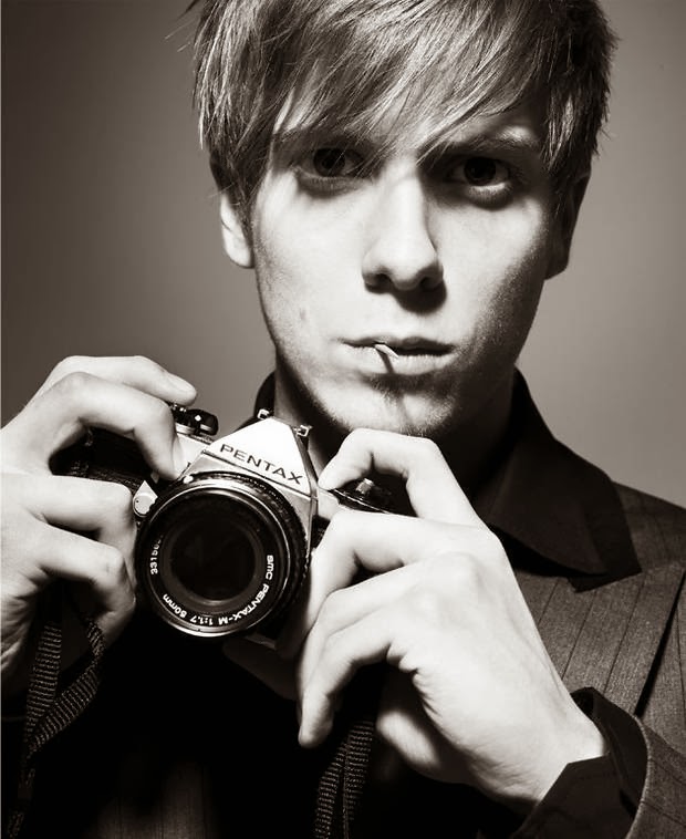

Craig McDean:


"Craig McDean is a photographer and filmmaker who is renowned for his striking fashion imagery and portraiture. Having discovered photography by taking pictures of his rocker friends in the North of England, McDean moved to London, where he assisted before striking out on his own with assignments for i-D and The Face."

For me, Craig McDean's work is exactly the type of work I would like to produce when it comes to taking my own photography. I love the softness and simplicity of what the camera is able to achieve, also I love how all of subjects in his work seem to have a mattified dewiness to their skin and this is something that I hope to do with my models because I want that type of glisten that these subjects seem to have. Also the backgrounds that McDean uses, such as the muted white backgrounds and the grey backgrounds, which I think look more unique than the traditional sold white. I am continuing to be inspired by McDean's work and hopefully by the time I come to take my photos, I will be able to replicate some examples of his work. 


Graphic Designers:

David Carson:


"David Carson (born September 8, 1954) is an American graphic designer, art director and surfer. He is best known for his innovative magazine design, and use of experimental typography. He was the art director for the magazine Ray Gun, in which he employed much of the typographic and layout style for which he is known. In particular, his widely imitated aesthetic defined the so-called "grunge typography" era."

I have been inspired by the work of David Carson as well, this is because I feel as though his work is something I want to emulate in my magazine. His typography skills and also the way he could piece pictures and colours together is something I wish to hopefully incorporate into my work. I also think his colour palette is one I would want to take on board with me as well because I like the way the colours mould together to create this blend of swirls. Also I love the design of the Ray Gun magazine, because even though the design is something I definitely want to take on board, it is also an alternative music magazine which means that I can use his original idea and hopefully create something just as good.

Neville Brody:


"Neville Brody is perhaps the best known graphic designer of his generation. He studied graphic design at the London College of Printing and first made his way into the public eye through his record cover designs and his involvement in the British independent music scene in the early 1980s."

I have been inspired aswell by Brody's work, he has been able to create works of graphic design that are innovative and quirky. Whilst still being modern and classic. I would say what inspires me the most would be The Guardian work that he did, even though this is by no means a music magazine I am still inspired by the design and the fonts also that were used. I would take none of these elements into my magazine however I have had numerous ideas just by seeing this work of what I would like to achieve in my own. The almost primary based colour palettes add something extra as well to Brody's work and this dedication to using the same colour palettes pretty much all throughout his work inspire me to really stay faithful to my colour palette and use that all throughout my magazine.