Created with flickr slideshow.
Friday 28 February 2014
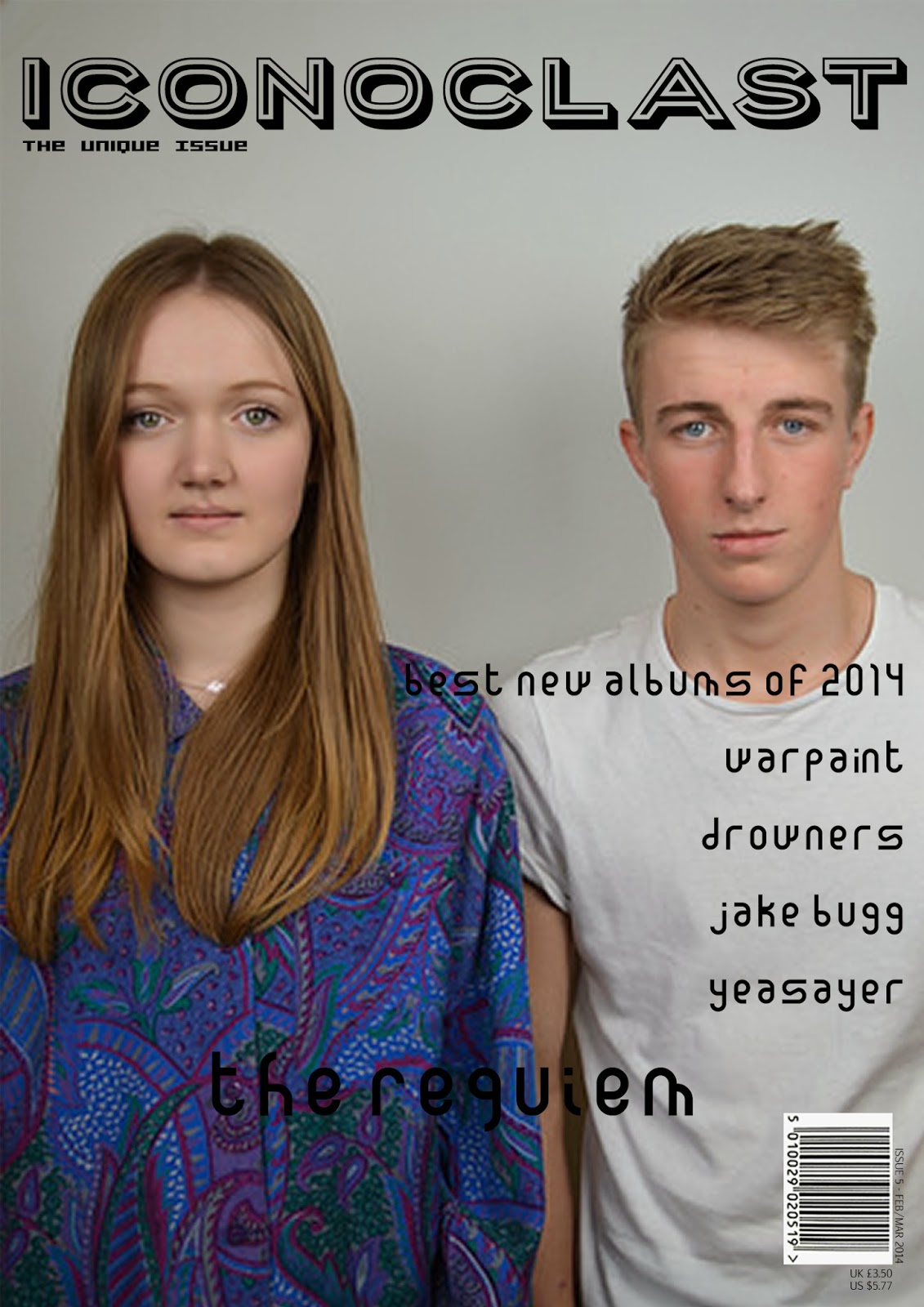
Second Photoshoot For Magazine:
Created with flickr slideshow.
Thursday 27 February 2014
Style Models:
After my draft I have been looking at other magazines to see which are the ones I have taken the most inspiration from, also the ones that have given me ideas of what I want to create in my magazine. This is important for my design because it enables me to realise what components of the magazines I'm reading will go into my own magazine and what I love the most about magazines of the same genre that are already on the market. Also with my style models I have been able to recognise what other magazines are on the market that are the same as my genre, because most shops only stock the really popular magazines such as NME and Q; I have been able to look beyond those and see the new and more quirky magazines that are more in keeping with the ideas that I have had originally. Magazines such as Clash, Dazed and Confused, etc have inspired me to think outside the box and push the boundaries on what is normal inside a magazine. My final magazine design will be slightly different due to the fact that I have thought of new ideas and those new ideas have sparked other features that I could possibly add to my design, and this is due to the fact that I have been able to look at different magazines and their layouts and features and by looking at them critically I have been able to see which aspects of that magazine I like the best and apply them to my own design.
The magazine that has influenced me the most would have to be Clash (in particular Issue 91, featuring both Earl Sweatshirt and Banks on the front covers)


The magazine that has influenced me the most would have to be Clash (in particular Issue 91, featuring both Earl Sweatshirt and Banks on the front covers)
For me this is how I would want my magazine to look, more so the front cover with Banks on the front because I love that photography (that is something I was intending to re-create however I struggled with finding a suitable way to do it within a studio) I also love the choice of font and how that was incorporated and laid out on the front cover because it looks so effortlessly placed on the page. For my next draft I might try and get a similar font and re-create this layout of the coverlines.
Also another aspect I like a lot is the different names for the issues (from L-R: The Festival Issue, The Tech Issue, The Fashion Issue, The Denim Issue), this is something I have tried to re-create this on my magazine already however I think I am going to alter it slightly (by just re-naming it). Also on these slightly earlier issues I really like the font used and again, the placement of the coverlines, I think it looks really classic and understated which is the look I would like to re-create on my final design. I have already started to develop my final design, it is a lot different than my first draft (implying to the front cover) and it also looks a lot different to these magazine covers, however I am still playing with ideas and I think I have time to experiment and see which design I prefer and see what fits the style of my magazine and genre the best.
Even though this magazine isn't quintessentially a music magazine (it is a women's magazine for fashion) I am still very inspired by the design of this magazine and it is one design option that I am thinking of because I think it could work in a music magazine context. The photography is something I am looking at as well and it is something that I am going to re-create; for example I am going to take the pictures and apply a black and white effect over the top to create a similar effect to 'The Gentlewoman'. Also with how they have different colours as the background with the white border surrounding the main image, I might see if it works on my front cover and whether I should include that on my magazine at all.
Monday 24 February 2014
Plan for the Week commencing: 24/02/2014
For this next week I am planning to continue working on my blog work and also to be improving my draft so it meets the standards it needs to be to reach the top grades. Also I am planning to take more pictures for my magazine, this is crucial to my magazine because the main feedback I got on my first draft was that my photos weren't up to scratch. I am planning on not to alter the light because last time I was trying to get a dulled down effect and slightly more dark (copying Clash magazine's winter double issue with Banks on the front) to add a more professional look I felt than the just solid white, bright effect. However in saying that, I am going to continue with the bright background and take more photos on Friday. Also I plan to still edit my pages, this will be a continual thing for the next three weeks, I am also going to be putting a blog post on this week about my style models and what has inspired me because that is important, also about which magazines have inspired features that I have included in my magazine (such as placings of page numbers, etc). Hopefully with doing all of this I will have a better idea of how my magazine will go and I can also feel more confident with my design.
Tuesday 11 February 2014
Draft Feedback and Action Plan:
The feedback I have had for my magazine has been very positive, I am incredibly pleased with how my draft turned out however I now have a clearer idea of the direction that I am intending to take with my final draft of my magazine. The main decision I have made so far is to re-take most of my pictures and to really style my models in a more slick manner to fit the rest of my magazine. This is because one of my models was wearing a Jack Daniels T-Shirt and it was a mistake on my behalf and I should have styled the models better and that is something that I am going to do for the next photo shoot that I will do. The logo on the t-shirt was too garish and bold for my magazine, it didn't fit the style or genre really of my magazine and so this is something I am going rectify for my final draft.
Another thing that I learnt from my feedback is that I need to make some of the writing on the front of my magazine legible because unfortunately the cover line on the front, when it was announcing my band The Requiem, was black and my model's shirt distorted the text and made it so it was almost unreadable. The contrast of colours was the problem and my next choice would be to either choose a re-done picture and make sure my model is wearing a plainer shirt; or I could change the colour of my font and this would definitely be the easier option however I might in fact change both of these elements because then I can really enhance my magazine to the standard that I am expecting of myself by creating something different to my original draft design.
Another element of my draft magazine that I need to improve on is the picture quality of my main DPS photos because the colours in the pictures are slightly off, to change this yet again I am going to take more photos. Hopefully now because I have more experience taking pictures that when I have my second photo shoot I will be able to take photos that really match the style of my magazine. Also because now I have had feedback, I really know the direction I am wanting to take with my magazine and the style I want it to emulate. So also I part of this re-design I am going to completely re-design the contents page and I know exactly how I want that to look. The contents page also will need some new pictures however I could use some from my photo shoot because there are some pictures that I haven't used already and looking back at the ones I have taken I feel as though there are some good ones that I can still use without them being discoloured and they are bright enough to look credible for a professional and slick monthly music magazine.
Also in my DPS I have used a lower case font and an upper case font for my introduction and main article. My feedback said that I needed to justify this more and explain where I have seen this done before and why I have included it in my magazine for this page. I have been looking at more individual magazine that use quirky layouts such as Clash and The Wire; these magazines don't use this text type and format but it is something that I imagine they would do. The particular fonts I have used are made to be lower case and upper case all the way through and that is something that I can't change unless I change my fonts altogether. I would prefer if the fonts were able to include both lower case and upper case in the set font and I am reluctant to change the fonts because I feel as though they match the style and format of my current magazine. The font I have chosen in particular for the introduction of my article, as well as using it for the front cover and contents, I have a particular fondness to as I think it really does fit the style and the way I intended the magazine to look like. For my next post I am going to be looking at my style models and what I am taking inspiration from to achieve my design.
Action Plan:
My first plan of action is to re-do my photographs for all sections of my magazine, I want to make sure that everything looks pristine and exactly how I want it, and this primarily means the photos because to me they aren't quite right. I love my choice of models and I will definitely be using them again however I need to properly make sure that my styling is exactly how I want it, and make sure that I tell my models what to bring so that they match the idea I have in my head. Also I'm curious to take pictures outside, however I don't think I will be able to as I don't have a professional camera at home and I have ideas about locations and I don't want to be limited to the school grounds. I have gained more inspiration from the likes of Clash and looking at past issues I have found a lot of features that have intrigued me. Such as, their page numbers are in the middle of the page and I really like that effect as it is different to any other page I have seen before. Also the layout in general is something I am inspired by with Clash, they arrange their text in a really unusual way and in my draft I tried to do this as well however I have been inspired by looking at different issues in Clash and finding different ways of laying out my text and even though I was pleased with my DPS generally I still want to try out more things and experiment to see if I can develop my skills further and make my magazine look more professional.
Also I am thinking I will change my contents page, which I have already discussed in previous posts. For this I am thinking of keeping it slick and simple; taking away the black background and the portrait style photo and maybe replacing it with a landscape version. Also I am really going to strip back the whole look so it really matches the style of my magazine. I will probably cut down the amount of writing or just make the text smaller. I wanted it to be fairly text heavy because I took inspiration from Clash, yet again, and their contents pages. Because they seem to have a lot of writing on their page and I wanted to replicate that in my own way. I might have included too much text to that page, and for that I will more than likely cut it down. However I might put the text in two columns to help to condense down the text even more, this will give a cleaner look to the contents page and hopefully give more credit to my magazine. There will be more improvements to be made generally which I am sure that I will comment on them in later posts.
Thursday 6 February 2014
Draft Magazine:
Front Page:


This is the front cover for my magazine. As you can see I have started off by getting the masthead in the right place and working around that because i felt as though it was important to get that in check before moving on to the rest of the cover because this is what draws the reader's attention first and it is important to engage them early on because then you are guaranteed to get a wider readership later on. Next on the first picture, I was going to put a border around the main picture just to reference other magazines such as Loud and Quiet and also others which have used this design in the past; however I decided against it in the end because I felt as though it didn't really look original enough (however it is still something I'm interested in looking at maybe for my final draft!) and I decided to stick to the main photo taking centre stage on the cover, especially with the photo I have chosen because I wanted to fill the page with my models because they are the main focus and I don't want to detract from that at all! I found all of my fonts on '1001 Fonts' and downloaded them to my home computer, I chose this website because I thought they had the most fonts which appealed to my style more and the quirkiness of the the fonts really attracted me to the website. Some of these fonts are ones that I had found for my 'Colour Palettes and Fonts' page so this research was crucial for my magazine because I was able to find a number of fonts that I have later used. I added the addition of "The Unique Issue" in reference to i-D magazine because instead of issue numbers they tend to have certainly named issues. I have chosen to do this (and also to do issue numbers as well) is because I felt as though this is another feature on the magazine that would attract an audience because they would be curious to see why it is a 'unique' issue! I have kept the white background on the barcode because I have been doing research and the magazines that have inspired me the most (which you can see in other posts of mine) usually do this, and it still looks classy and relevant to the cover as a whole. I am quite proud of my cover, but I realise that this is still a first draft and I would like to still develop this idea further and make sure that it is up to the level that I expect of myself.
Contents Page:


This is my contents page. I have gone through quite a lot of ideas for this final design for my first draft to come out, and I still have a lot to work on to achieve a professional finish that I am wanting. I have put an effect on the main picture on this page to make it more unique and original. It adds a special effect on the white background which I think works quite well, however this is something that I might change again because I don't know whether it works for my magazine as a whole. Creating the contents page is one of the hardest parts of the coursework for me because it is so easy for it to look 'slapdash' and unprofessional; This I want to rectify because for my standards this just doesn't look right. This is a learning curve for me and since doing this page I have learnt a lot more about how Photoshop works and for my final draft I am planning to step up my game and create something that meets my standards. However I do like the fonts used (again found on 1001 Fonts) I think that they are quite different, and the layout of the text also is something that I am pleased with. I took inspiration from Clash magazine for the layout of the text as I thought that this was a good way of making the text look good and also to fit in a lot of information into a small area. I have also took inspiration from the black background in Clash and this is something again which I might change for my final draft as I want to see all my options and conclude what I want to do for my final design. Also something I realise now that I need to rectify in my final draft is the addition of the page numbers in the corner, this would have added realism and it is something that I am definitely not going to miss out in my final draft. I added a white border around the writing, this is because I have a black background and I still wanted the black writing so I had to do this to fit my design. However I like the look that this has produced and with the font style I have chosen I think the whole writing style really has worked well for the design and style of the magazine. I think what I would work on for my final draft though is the background colour and also the picture layout because it could look better.
Double Page Spreads:


This is the final design for my Double Page Spread. I am generally very pleased with his design, I think it fits into my target market easily with the unique layout of the text and also the kind of photos I have taken. Out of all the pages I have created so far, this is the one which I imagined in my mind in the first place. For this I have taken inspiration out of magazines such as The Wire, this is because I really like the way that they set out their articles because of the fact that they manage to create an interesting page, not only to read, but also to look at and this is what I wanted to achieve! I had started off, which isn't shown here, with a full image on the right hand side; I had decided that this didn't really look the way I wanted it too and so I changed it to two pictures to give, yet again, a more interesting page to look at. I have used the same fonts from both my contents page and front cover in this DPS, this is so I make sure all the components are connected together to make my magazine come together as a whole. I have tried on this piece t make sure that everything fits together and deleted and altered things that I think do not work as a collective. For example, as I said before, the full image. It just didn't work and I had to get rid of it. On the top image on my DPS, one of my models had a piece of hair falling down on her face; so for this I had to Photoshop that out and also I enhanced the photos to make them look slightly brighter so they stood out even more on the page. I chose to layout the text in this different way as well because I thought it would look slightly abstract for the reader to look at; also with the addition of the writing above the main article, to introduce the text, I like the fact that the font is different for both sections as I think it really sets apart the start of the article and the the main text. I have also added a bar across the top of the page, this is to connect the DPS to the rest of the magazine and also to show the page number. I think with this it brings the page together and makes sure that both the photos and the text are connected and look as one together.
More Covers That Have Inspired Me:


Here are more covers that have proceeded to inspire me. I am in the middle in creating my draft and I have been looking at more unusual pictures that have helped me to actually reach a new creative level. I want to be creating something different and original and to do that I want to see the magazines that have excelled themselves in being unique. What I love on these magazines is the simplicity and also the colours schemes. With magazines such as Betty (which isn't actually a music focused magazine) each of the issues they release coincide with each other and the colours, even though they're different colour schemes, work together all the time and it looks like the style of the magazine is really reflected on what the colour scheme is. Also Betty doesn't include the bar-code on the front of the magazine which is unusual and not really seen throughout the magazine community. This subtraction of this 'vital feature' really sets apart this design and the differently coloured backgrounds, instead of the usual white or mono-tonal shades, also attract the reader's attention. The rest of the covers I have found are also set apart by either their colour scheme or the style of photograph taken, and sometimes even both. This originality and uniqueness have really captured my eye and I'm sure they capture many others as well. 'Studio' magazine is one that has really had an effect on me and the complete yellow scheme of colour is really something that I may try to incorporate into my design; especially on the cover, colour schemes need to be kept simple and this is a good example of this because it is such a bright colour that it is different compared to the usual black or white. All of these covers have really had an effect on my first draft and I am going to take inspiration from them for my final draft as well. Hopefully I will have the chance to be able to re-do a few pictures this is because I would like to get the same kind of effect that these magazines have seemed to produce.
Subscribe to:
Posts (Atom)